To some people, this looks like nothing.
But to actual prospects for this product, this ad, from 1988, looked very interesting indeed. In ways that matter.
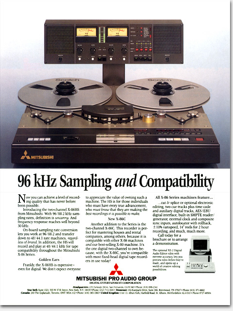
With its deliberately straightforward, no-nonsense look, it delivered its message effectively and with extremely high credibility. Great care was taken in all aspects, even the exact photo angle was chosen to show the product just as it would be seen in use by the prospect. Or to put that more accurately, just as his old one is presently seen in use—the old one that he now can’t wait to replace with this one.
Though lost on the screen image you are seeing here, this ad’s typography was especially crisp. I chose a highly-chiseled, little-used font and modified it in an effort to reinforce the quality of clarity in the ad—clear sound, clear reading, clear choice.
This layout said quality loudly and clearly in a magazine otherwise filled with products flying through space and other such nonsense the reader couldn’t care less about. Here it is plain to see, to me at least, the difference between the “classic” and the “stock.” And, for that matter, the difference between simple and plain. To the target market, this ad hit right between the eyes with a strong message unhindered by pointless diversions in the guise of “art.” 96 kHz was a huge buzzword at the time.
This classic layout is what advertising giant David Ogilvy called the “normal” layout and I have sometimes heard referred to as the “type A” —long known to be the best performing layout in terms of readership and results. Lesser ad people continue to deny it. As I said, to some people, this looks like nothing.
What: Concept, copy assistance, design, photo art direction, production art
For: “96 kHz Sampling and Compatibility” full page color magazine ad
Client: Mitsubishi Pro Audio Group
When: 1988
©Copyright 2008-2020 ericwrobbel.com. All rights reserved.