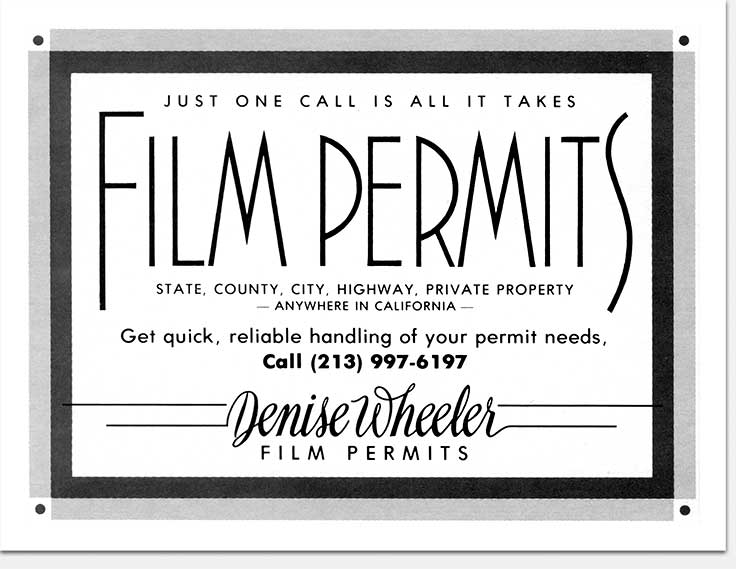
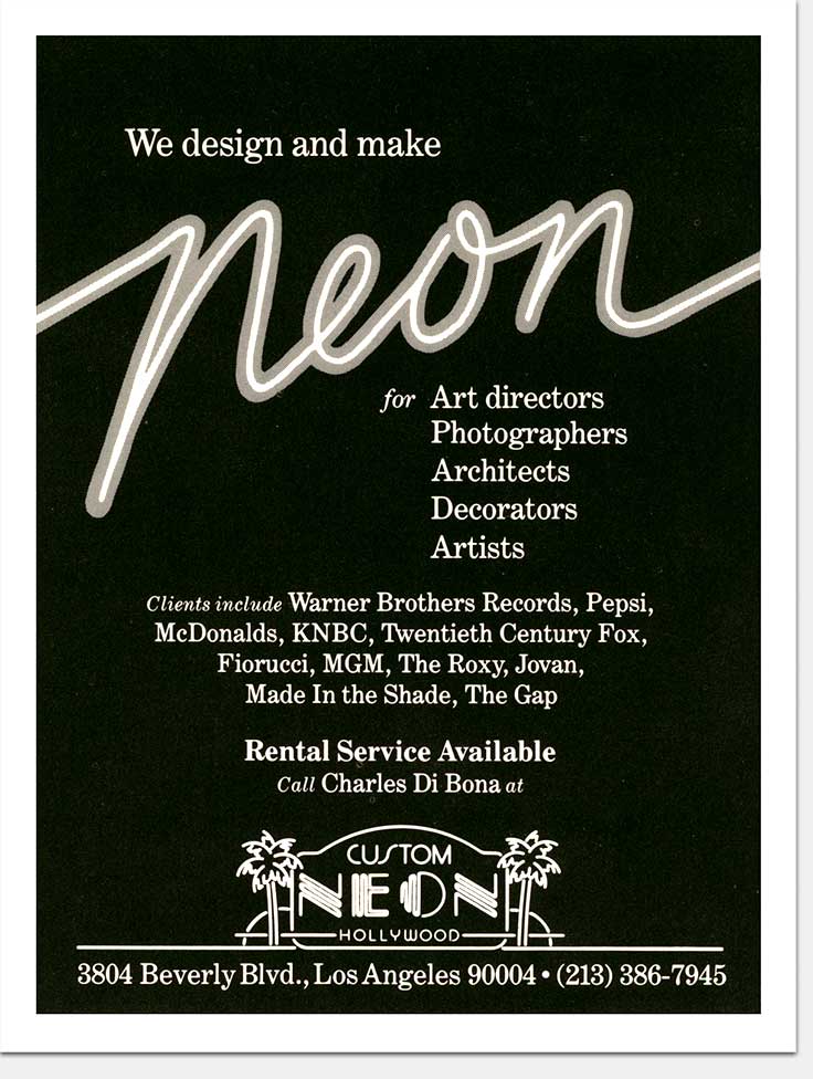
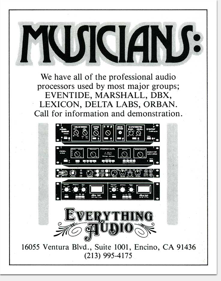
These small quarter and third page ads appeared in various magazines. As always, I tried to make them “command the page”—here through the use of large hand-lettered type. I like to see my little ads be the most attention-getting thing on the entire page spread.
So much communication is backwards in its approach— conceived by people who are convinced the world waits anxiously for every word they have to say. Well it doesn’t. To really communicate, focus on your audience’s needs, not yours. Effective print communication reaches out and grabs visually, while simultaneously and immediately giving relevant information of interest to the reader. You’ve got a second or less to do this, so don’t squander it primping and looking in the mirror.
Obvious? Of course. So why do so many go so wrong so often? Two things. The first being that ego thing already mentioned—that point of view that all you have to do is show up and you are automatically the life of the party. The second thing is in that word relevance. Your audience’s attention will not be won unless what you have to say is relevant and interesting to them. And they define what is relevant and interesting, not you. So listen and find out. Before you ever even start to formulate your message, ask the right questions and listen.
What: Concept, copy assistance, design, art
For: Partial page advertising
Clients: Denise Wheeler Film Permits,
Custom Neon, Everything Audio
When: Late 1970s, early 1980s
©Copyright 2008-2021 ericwrobbel.com. All rights reserved.