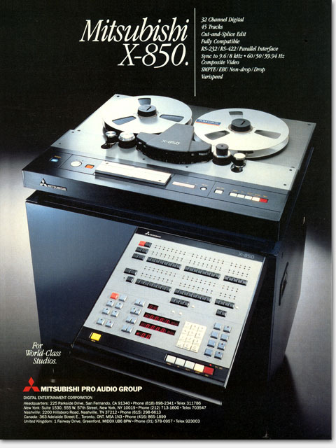
Ad for Mitsubishi X-850 Digital Audio Recorder. From its creator: 'At the time, ads in pro audio were dominated by stupid 'flying-through-space' layouts and clunky, cold, techie type styles. I used instead a classic, elegant type treatment and let the reader see the goods without my 'art' getting in the way. And that IS my art. This very expensive recorder simply HAD to rise above the pack, and it did.' Design and art direction by Eric Wrobbel: https://www.ericwrobbel.com/art/mitsubishix850.htm

What: Concept, copy assistance, design, art

For: “Mitsubishi X-850.” full page color magazine ad

Client: Mitsubishi Pro Audio Group

When: 1986


Rising above the competition

This advertisement is noted for its early use of an elegant type treatment in a field (professional audio) then dominated by clunky, techie type styles. This very expensive recorder simply had to rise above the pack, and it did.

Logic is essential in planning advertising. A tiny picture of the product would have been meaningless here. Instead a bold type-only assertion is made and put across nicely in this strip ad that ran on the front page of a trade show daily newspaper. The technique of setting up an arbritrary boundary (here the blue box), then blowing past it with type can add to a sense of urgency. Mitsubishi X-80 and X-86 Digital recorders ad by Eric Wrobbel: https://www.ericwrobbel.com/art/mitsubishix850.htm

Vibrant and powerful. A tiny picture of the product would have been meaningless here, in my opinion. The bold assertion that Mitsubishi was the major player in delivering new digital tape machines was the point here and we got that across beautifully in this strip ad that ran on the front page of a trade show daily newspaper. One of my favorite techniques of the time was to set up an arbritrary boundary (here the blue box), then blast through it with the message. I thought it gave a sense of urgency and of importance. When properly done, I believe the technique can still be effective, though in today’s graphics climate absolutely everything is presented as urgent. Using this technique these days without great care and awareness of an ad’s environment can result in simply getting lost in the noise.


What: Design, layout, art

For: “X-80 X-86 The Digital 2-Track Standard” banner ad

Client: Mitsubishi Pro Audio Group

When: 1985

Logic is essential in planning advertising. A tiny picture of the product would have been meaningless here. Instead a bold type-only assertion is made and put across nicely in this strip ad that ran on the front page of a trade show daily newspaper. The technique of setting up an arbritrary boundary (here the blue box), then blowing past it with type can add to a sense of urgency. Mitsubishi X-80 and X-86 Digital recorders ad by Eric Wrobbel: https://www.ericwrobbel.com/art/mitsubishix850.htm


©Copyright 2008-2020 ericwrobbel.com. All rights reserved.